
PROJECTS
Website and internal web applications re-design for a digital career platform
Career Planning
SaaS
B2C
B2B
Web Design
Staffing Agency
Software


The Company:
Journeyman is a digital career platform for electrical and energy specialists. The company aims to bring people and companies together and make the searching for a job period as easier as possible for their talents.
My Responsibilities:
I was responsible for constantly re-design and update the main website (adaptive) alongside the internal applications such as Dashboard for our colleges and for our partner companies and Talent Registration Form with our development team.
Maintaining the design systems
About Project
About Project
Design Process
Design Process
Survey Analysis
Benchmarking
Persona Creation
Moodboard
Concept Creation
Survey Analysis
Benchmarking
Persona Creation
Moodboard
Concept Creation
User Flow
Wire Framing
Functional Prototyping
User Flow
Wire Framing
Functional Prototyping
Visual Concept
Design System
Component Library
Visual Concept
Design System
Component Library
User Interviews
User Interviews
Research
Research
Testing
Testing
Prototyping
Prototyping
UI Design
UI Design
Adventure Abroad (2nd business unit)
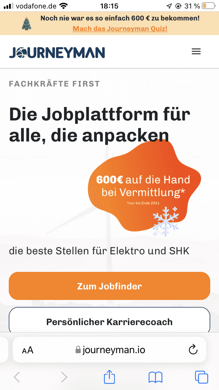
Main Website


Dashboard re-design
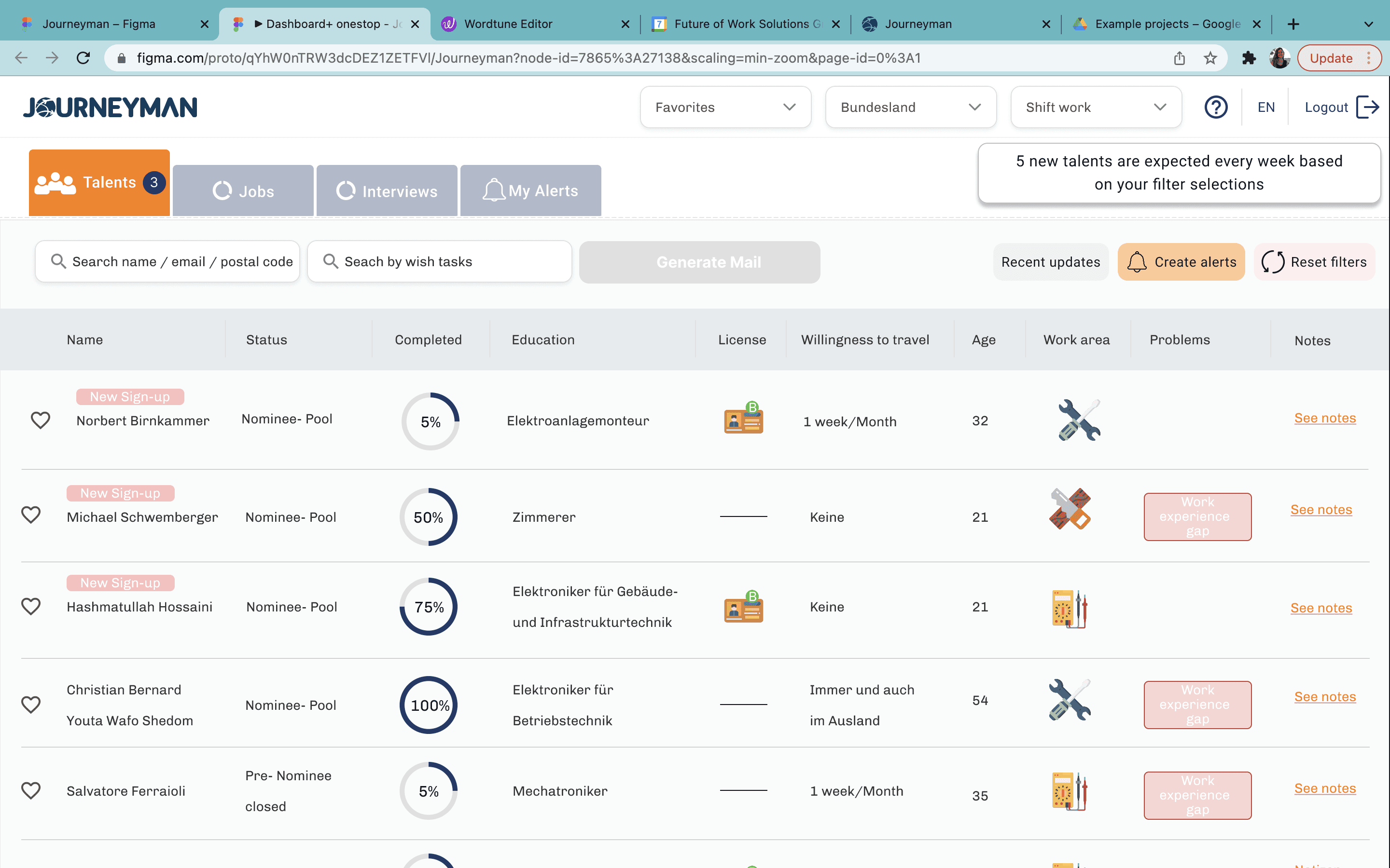
Dashboard
Jobs Section:
Word “matched” is confusing, needs to change to “talents”. People get confuse when they see the company name in the “matched” section instead of talent names.
A filter section for jobs part is needed
“Willingness to travel” also should be visible after experience level
Candidate Section:
People want to see with which companies talents matched under their names
Filters are easy to use
The new look is way better than the previous one ( scrolling to left/right was not pracical)
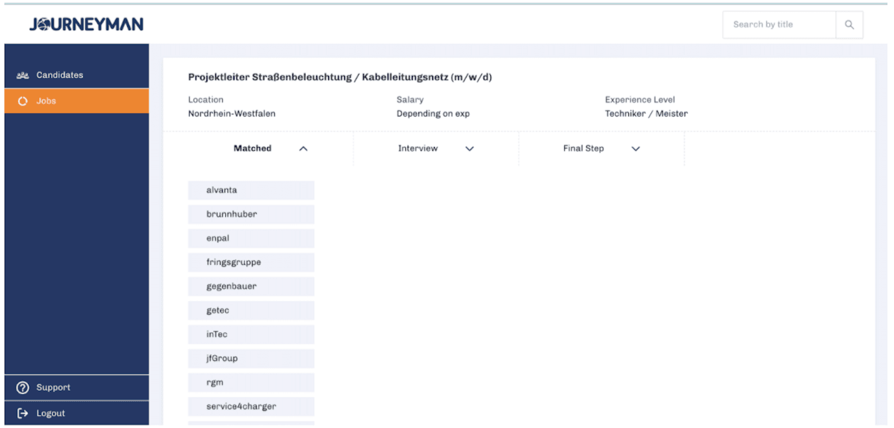

We update and improve our internal applications regularly as well as our local page and adventure abroad website. Due to constant improvements and new features a new design was needed to our dashboard to make it more usable.
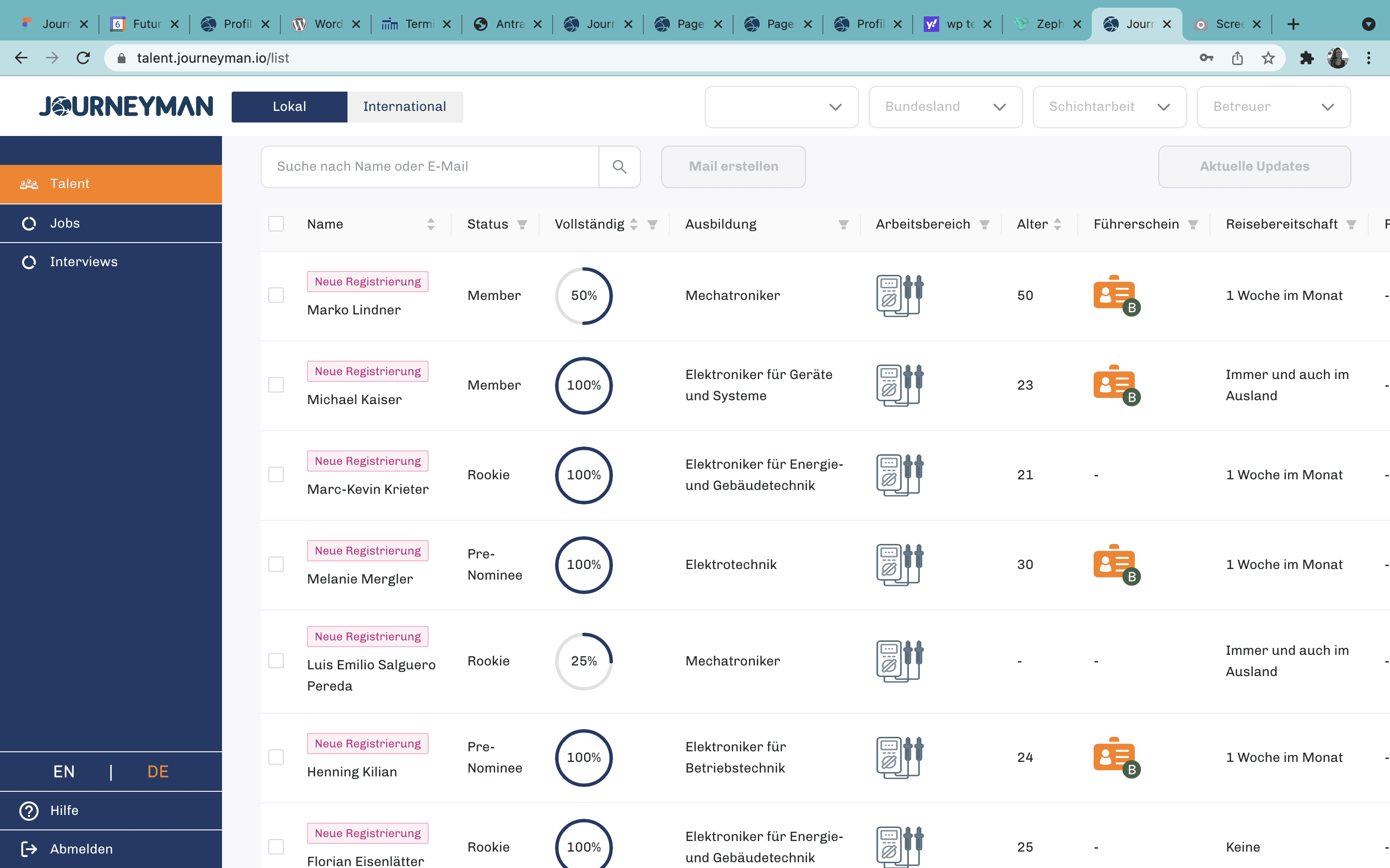
Talent App re-design
Talent App
Overall:
They want talents to filll the form themselves (some kind of reminder for talents to fill the rest of the form)
They want “Notes” section to be blank so they can write themselves.
Education:
Free text section is needed if someone says “other”
Experience should be seen before “Besonders gute Fahigkeiten”
Fahigkeiten und Praferenzen:
“Monatliche Gehaltserwartung”: Free text section is needed to write the salary range themselves
Persönliches Angaben:
People wants to track the notes chronologically (from latest to oldest)
Having full adress is better than only postal code.
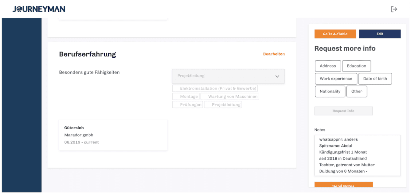


Our research showed that our users don’t fill the form themselves, instead our talent managers were filling it for them. One of the-reasons were, the old form was containing 4 different steps with lots of questions. We decided to make the form more visually appealing and let them our users to fill the necessary parts in only 1 page.
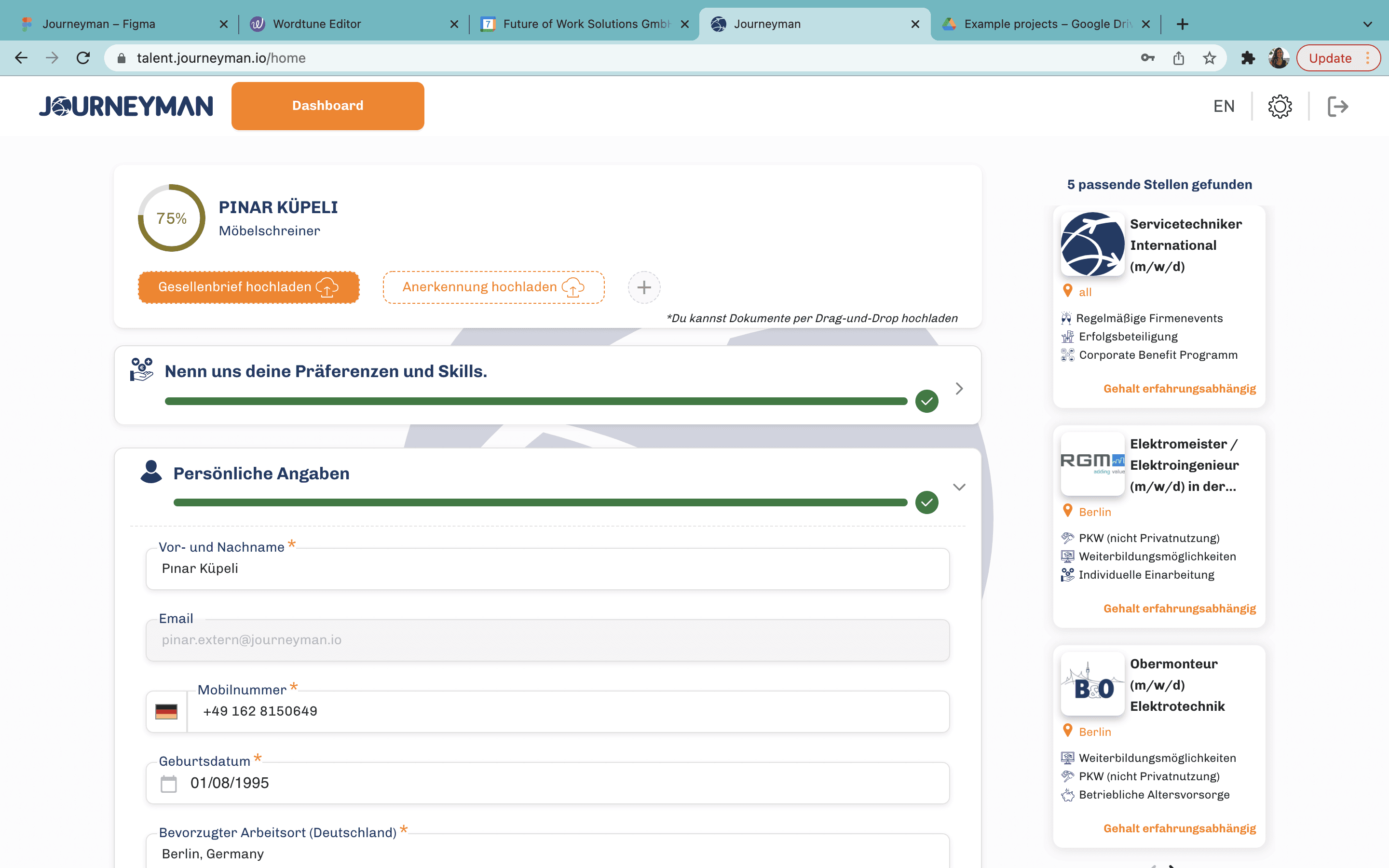
Talent App for skilled workers to fill their informations so Journeyman
match the talents with their partner companies.
WORK
UX/UI Design case studies
I've assembled a series of recent UX/UI design projects to demonstrate my approach


WORK
UX/UI Design case studies
I've assembled a series of recent UX/UI design projects to demonstrate my approach
Pınar Küpeli
Thanks
Thanks so much for taking time to check my portfolio
PROJECTS
Website and internal web applications re-design for a digital career platform
Career Planning
SaaS
B2C
B2B
Web Design
Staffing Agency
Software
The Company:
Journeyman is a digital career platform for electrical and energy specialists. The company aims to bring people and companies together and make the searching for a job period as easier as possible for their talents.
My Responsibilities:
I was responsible for constantly re-design and update the main website (adaptive) alongside the internal applications such as Dashboard for our colleges and for our partner companies and Talent Registration Form with our development team.
Maintaining the design systems
About Project
Design Process
Survey Analysis
Benchmarking
Persona Creation
Moodboard
Concept Creation
User Flow
Wire Framing
Functional Prototyping
Visual Concept
Design System
Component Library
User Interviews
Research
Testing
Prototyping
UI Design
Adventure Abroad (2nd business unit)
Main Website
Dashboard re-design
Dashboard
Jobs Section:
Word “matched” is confusing, needs to change to “talents”. People get confuse when they see the company name in the “matched” section instead of talent names.
A filter section for jobs part is needed
“Willingness to travel” also should be visible after experience level
Candidate Section:
People want to see with which companies talents matched under their names
Filters are easy to use
The new look is way better than the previous one ( scrolling to left/right was not pracical)
We update and improve our internal applications regularly as well as our local page and adventure abroad website. Due to constant improvements and new features a new design was needed to our dashboard to make it more usable.
Talent App re-design
Talent App
Overall:
They want talents to filll the form themselves (some kind of reminder for talents to fill the rest of the form)
They want “Notes” section to be blank so they can write themselves.
Education:
Free text section is needed if someone says “other”
Experience should be seen before “Besonders gute Fahigkeiten”
Fahigkeiten und Praferenzen:
“Monatliche Gehaltserwartung”: Free text section is needed to write the salary range themselves
Persönliches Angaben:
People wants to track the notes chronologically (from latest to oldest)
Having full adress is better than only postal code.
Our research showed that our users don’t fill the form themselves, instead our talent managers were filling it for them. One of the-reasons were, the old form was containing 4 different steps with lots of questions. We decided to make the form more visually appealing and let them our users to fill the necessary parts in only 1 page.
Talent App for skilled workers to fill their informations so Journeyman
match the talents with their partner companies.
WORK
UX/UI Design case studies
I've assembled a series of recent UX/UI design projects to demonstrate my approach
Pınar Küpeli
Thanks
Thanks so much for taking time to check my portfolio